Hi all. I've had a few people ask me about my experience with the Make Art that Sells Illustrating Children's Books course, so I figured I'd write about it. I'll warn you, this is a long post! First I'll talk a little about my week to week experience, and then I'll share my thoughts on the class as a whole.
Prep Week
I decided to take the Illustrating Children's Books course on a whim. Well, to be more precise, I did the free pre-class prompts on a whim, and got so much out of the experience, that I decided to enroll in class. (The prompts are all available on the Make Art that Sells blog here.)
MATS Illustrating Children's Books Prep assignments
The prep week includes five days of prompts, and I experimented with each one. I was struggling with my art when I started, so I explored different styles. I only intended to do the prep week, but by the end I'd arrived at a place I was really happy with, so I decided to continue.
The course is laid out in five weeks, with each week devoted to exploring a different skill necessary to break into the picture book industry. There is one main assignment each week and six small sketchbook assignments. There is a ton of information sprinkled throughout the course on topics such as building your portfolio, pitching to publishers and agents, and the industry itself. At the end of each week, students submit their main assignments, and a few days later, the instructors, Lilla Rogers and Zoë Tucker, publish a video providing feedback on some of the students' work.
Week 1
Week 1 Assignment: Character
Week 1 is all about picking one of three stories and designing your main character. Each story is written by Zoë Tucker, a creative director in children's book publishing. For this class, we were given texts that feature a little girl, a turtle, and an egg and spoon. I used a provided worksheet to examine the texts and ended up choosing the turtle text.
The first week was both exciting and frustrating. I went in knowing I had a lot to learn, but also feeling pretty good about my skill level. But after seeing my classmates' work, I knew I had to step up my game. The level of talent in this class was amazing, especially given that it's open to anyone. Sure, there were people at all different skill levels and points along their career paths, but on the whole, it was well above average. That was the exciting part.
The frustrating part came when I realized that all of the content was designed in a previous course and with different texts in mind. A big part of Week 1 is about giving your character personality through accessories, but the text I chose featured a newborn baby turtle...not typically known for their ability to accessorize. Now, I could have claimed artistic license and put my character in footy pajamas (which would have been adorable, now that I think of it), but I was also under the impression that my text was supposed to have a nonfiction slant...another misunderstanding which arose due to dated content.
The frustration was amplified at the end of the week when our assignments were reviewed. I understood the format well enough that I didn't expect to be personally reviewed, but in fact very few turtle assignments were. So, not only was I feeling unsure if I was on the right track and wishing I'd chosen a different text, I was also left with very little guidance to bring into the second week.
Week 2
Week 2 Assignment: Emotions
The lack of accessories aside, I felt pretty good about my turtle in Week 1. I'd done a lot of sketching from photos, and I felt I had something with personality that was also anatomically accurate. But after watching the review, I decided to pull what I could from the feedback and apply it to my turtle. Most of the feedback was about the little girl text, specifically how to make her look younger, but I wanted to do what I could to make my turtle as compelling as possible, so I pushed the proportions a bit.
I think the emotions came out okay for a creature with no eyebrows and a very inhuman jaw, but they might be a bit cartoony. I tried something different with the style, but I still felt like I was struggling.
Fortunately there were more turtles in the review this week. I was still a little frustrated by the importance the instructors put on accessorization, but some of the class handouts showed great examples of animals with no accessories, so I decided to stick to my guns and trust that my character had enough personality on its own.
Week 3
Week 3 Assignment: Poses—Turtle (digital)
Week 3 Assignment: Poses—Tiger (gouache)
Week 3 was all about poses. This was the only week that we were allowed to turn in two assignments, one for our main character, and one for our secondary character(s). I sketched a lot of tigers that week! It turns out that I really enjoy drawing tigers (way more than turtles, apparently). I ended up liking one of my tiger sketchbook pages so much that I decided to use it as my assignment.
Then I tried to paint a turtle page to go with it, but instead of doing it in gouache like I should have, I did it digitally. The truth is, I've been working digitally much longer than I've been painting, and not having a CTRL-Z scares me. So if something's important, I prefer digital, but I'm trying to push away from that. I've learned (in large part due to the work I did in this class) that working without a safety net allows me to produce better work. Strange how that works.
I was not happy with my assignment this week, and I even considered not submitting it. But I did, and I was one of the people selected for review. The criticism was on the gray background...Zoë said a lighter background would be better, and I agree.
Week 4
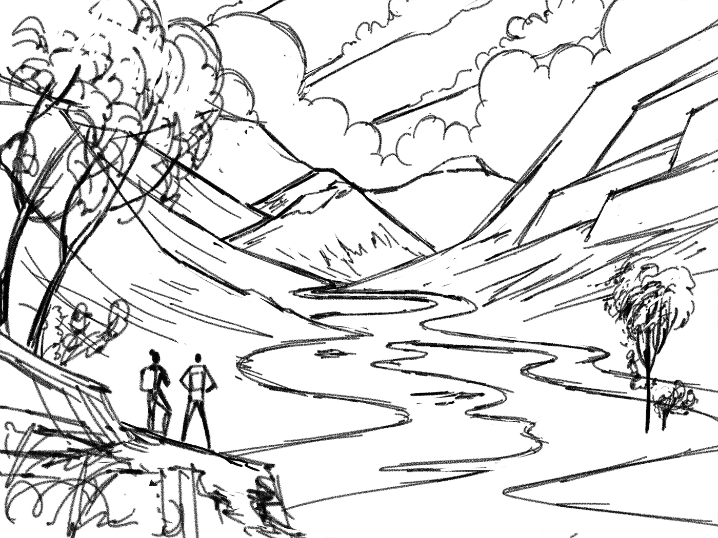
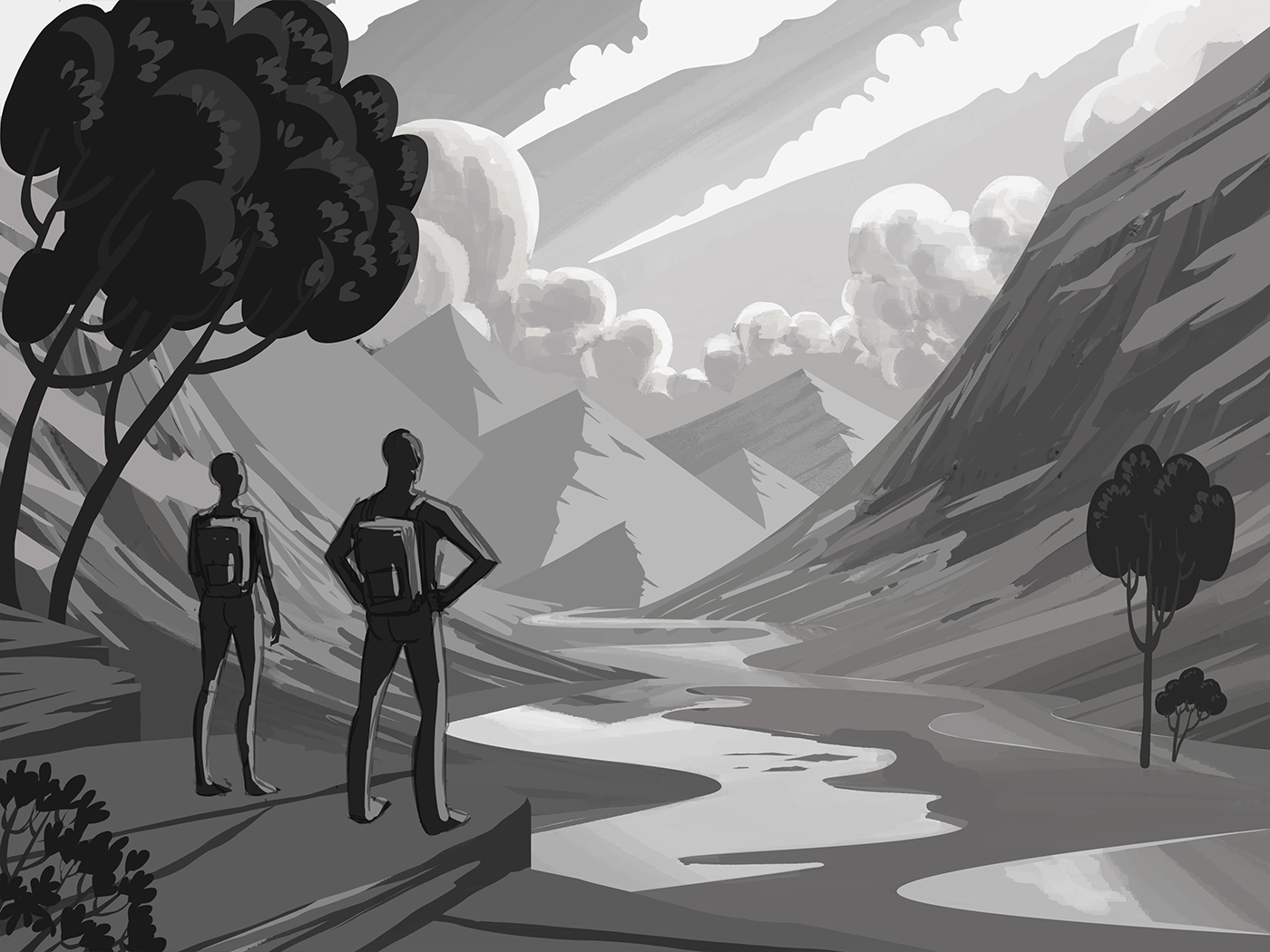
Week 4 Assignment: Environment
This was the week I'd been looking forward to the most. I think I'm strongest at environments, and I really wanted to show it, so I put everything I had into this piece. I painted all of the characters in gouache, but I created the environments digitally. In hindsight, I wish I'd painted everything, and I considered it, but I was still too afraid to get completely out of my comfort zone. When it was all said and done, I spent over 50 hours on this spread, but I think if I'd painted it, it may have taken less time and garnered better results.
I did not make the review this week, and although I knew it was a longshot, part of me thought that if I tried really hard, I could make it. I was really bummed at first, but I got over it. Resilience is key.
Week 5
Week 5 Assignment: Cover
This was the final week of class, and it was a breeze compared to the week before. I still worked hard (I created over 20 thumbnails for this assignment and developed two finished pieces). But a lot of the decisions about characters, style, and color were already made earlier in the course, which left me free to focus on composition. I know that's something that Lilla focuses on a lot in the class...creating assignments that build off one another, so that the big assignments feel more manageable. It really does help. As she says, "yard by yard it's hard, inch by inch it's a sinch."
I made it into the review again, and this time for good design. It was a really nice way to wrap up the class.
Course Review
I got a lot out of this course, but like anything, you get out what you put in. For me, it provided clarity. I went into it very unfocused. My work felt all over the place, and I didn't know what kind of work I wanted to do. But through the dozens of pieces I created over the six weeks of class (including the prep week), I learned a lot about my art, and how to highlight my specific skills. I know this because the work I've produced since completing this class has improved dramatically. It's not because of any one thing that was taught in class, it was just the sheer volume of work. I explored a lot, and it helped me see what was and wasn't working. I also came away with a clearer understanding of my next steps. I know what I need to put in my portfolio, and I know how to leverage it to get work.
But of course nothing beats a good pros and cons list, so here goes:
Pros:
There is a wealth of content. Between all the handouts and the class posts (which I've saved), I have over 80 PDFs of material, many of which I will continue to reference after the class.
The community is fantastic. Each course has it's own facebook group filled with inspiring and helpful artists, many of whom are professional. Some of my classmates were even artists I already admired and followed on Instagram! This community is invaluable when it comes to feedback, and (at least in my experience) the group is still active well after the class had ended. I love seeing new work from my classmates, and it's been wonderful to be able to get their opinions on new projects.
It is very motivating. The size of the class combined with the level of skill from my classmates, means there's a lot of competition for the limited review slots. Everyone is constantly bringing their A game, which means you have to, too. That means the class is hard and will kick your ass, but you'll also get a lot out of it. Lilla and Zoë also spend a lot of time showing you how to put together a great pitch, so you leave the course feeling like you know the kind of work you need to produce, and where to send it once you're done.
You'll (probably) get portfolio pieces out of it. I say probably because it depends on where you are on your journey. I had classmates that were so secure in their style that I have no doubt every piece they did made it into their respective portfolios. I've included a few of my assignments in my portfolio, but I was too unsure of my style going in to produce fully cohesive pieces for the entire course.
Cons:
Much of the course is prerecorded, and it's a little one-size-fits all.
Sometimes (as I discovered) a specific text won't align perfectly with course material, but that's not to say you can't still learn from it. You could have a text about sentient hamburgers, and you'd still learn something if you put in the effort.You (probably) won't get reviewed. I was very lucky. There were over 300 people in my class, and only roughly 10% made it into the reviews each week. Even if there weren't repeats (which there were), with only five reviews, that still leaves a lot of people out. Not making the review each week can feel like rejection. It is wise to make up your mind going into the class that you will try to get the most out of every week, even if your work is never reviewed.
You will not learn to draw. This isn't really a con per se, it's just that this is not an art class in the traditional sense. If you're looking for drawing lessons, you're probably better off looking elsewhere. This is more of a career guidance class. It takes the art that you do, at the skill level you're already at, and teaches you how to improve its marketability to agents and publishers. There are a few drawing demos, but they're short and pretty remedial. You are more likely to improve your drawing skills through the daily sketchbook assignments.
Final thoughts
Would I recommend this class? Absolutely. It's worth it for the materials, the community, the portfolio-building assignments, and the career guidance. All of that stuff is yours to keep well after the class is over, so even if you aren't very skilled at art yet, you have it for when you're ready to start your career. That said, if you're not already skilled at drawing, the work of your classmates could be intimidating. It's bit of an emotional roller coaster, and it's a lot of work, so make sure you're in a position to give it your all, and be ready to jump in with both feet.


