Zoo Heist!
Due to a complete coincidence, I'm going to be in Italy right around the time of the annual Bologna Children's Book Fair, so I decided to attend. In addition to the book fair, the coordinators also release an Illustration Annual, a book filled with gorgeous illustrations from established and up and coming illustrators. It's very hard to get in (they get thousands of submissions), but if you submit, you get discounted entry to the book fair! And of course there's the added benefit of having a few more portfolio pieces, so I decided I ought to give it a go.
The brief was simple: five pieces, no more no less, all with a common theme. I ordered a few of the recent years' annuals for research purposes and went to work. The scope of work in the annuals is very broad, and I would say it has a bit of an editorial feel. At least on the whole, it seemed more mature than typical picture book art. But my pieces had to act as portfolio pieces, too, so I needed them to show prospective agents and publishers what I could do. Before I chose my theme, I made a list of everything I wanted to demonstrate with these pieces. The list is a mixture of things publishers want to see and things I'm particularly adept at. Gotta put your best foot forward!
Once I had my list, I started thinking of scenes that would demonstrate these elements. I put pencil to paper and drew over 30 thumbnails. As I worked, a story started to emerge. I narrowed down the thumbnails to the five that best checked all the boxes, and Zoo Heist was born!
I knew I wanted to work in gouache, but I also wanted the freedom of arranging pieces digitally, so I developed my sketches in Photoshop before committing them to paper. I sketched in black and white, reworking some of the compositions until I had five pieces I was happy with.
Then I added color. I worked on all five thumbnails at the same time, making sure I had a cohesive palette.
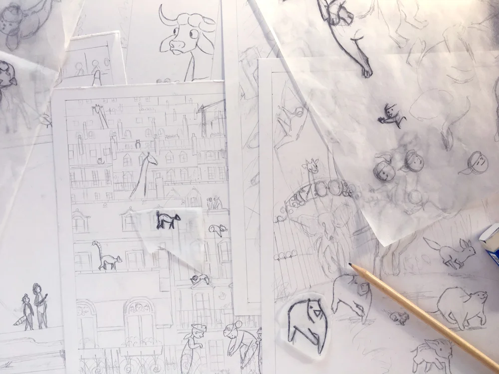
Once I had my colors figured out, I started drawing on Bristol. I drew all five pages freehand, based on the thumbnails I developed. Drawing on paper is a little nerve wracking for me. I'm very accustomed to working digitally. I like to try things out and reposition stuff. So I decided to incorporate tracing paper into my process. It was the best decision! It gave me a lot of freedom to test things out and see how they'd look before committing.
Once the pencils were done, I started laying in some washes. The purpose of this base layer was to lay the foundation for the lights and darks, and to provide an undercoat of color to make the colors richer and more textured. I used Acryla Gouache for the first time, which was a little bold, but I knew I had to work fast, and I wanted to be able to layer colors without reactivating them. Unlike real gouache, Acryla Gouache uses and acrylic binder, so it's waterproof once it dries.
I then went to work painting the pages. I only had a few days to finish everything, so I painted quickly and loosely, knowing that I would be able to tighten everything up digitally.
Once the paintings were done, I scanned everything in and did an overpainting in Photoshop. I adjusted the lighting and enhanced the compositions as necessary, but mostly I tried to stay true to the original paintings.
I worked down to the wire. I put on the finishing touches on the morning it everything was due! Fortunately I invested in a good printer, and printing everything without a hitch. Then I just had to put my packet together and rush off to the post office!
There you have it! Here are the finished pieces:


